
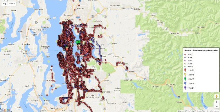
Stop-level King County Metro ridership map. Click on a stop to see ridership at different times of day. Seattle Globalist Columnist Goorish Wibneh produced a series of infographics illustrating ridership on King County Metro for KBCS as part of a project called What’s the Flux?: Commuter Dispatches. All data is from King County Metro except where noted.
During this 9-month project, riders shared their Metro stories and experience.
Listen: Riders share their stories
More stories from the commute at KBCS.fm »
These rider stories are hidden gems that introduce us to a fast-developing subculture of public transportation.
But not everyone has it easy riding Metro.
Sonnet, who spoke with a KBCS reporter, works as a bartender in Downtown Seattle and Capitol Hill.
She’s a late night rider using public transportation to get to and from work. She lives in Greenwood.
Sonnet said, “I don’t think [Metro] was well thought through, it only benefits the people who can afford to live in Capitol Hill, but the outlying neighborhoods have to transfer two or three buses to get to well-paying jobs.”
Sonnet could also be speaking of others who live further away from the city.
Jamila who works for Intermedia in Bellevue uses perhaps the strangest route in King County: the 342, which manages to travel from Aurora Village to Renton without passing through downtown Seattle. She raised a question of efficiency.
“The farther away you get from Seattle the less efficient the bus systems are in how far they go, how frequently they come,” she said.
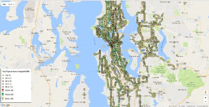
Load map.The greener the better. Click on stop for details. The green dots indicate the most common load (up to 10 riders on board as the bus leaves a particular stop). If there are consistent color dots along subsequent stops, either not many people are getting off along the route (for shorter commutes) or the buses are overcrowded (for longer commutes).
More graphics
Project Credits
This project was produced by Mona Yeh in collaboration with Eastside radio station 91.3 KBCS with funding support from Association of Independents in Radio (AIR) as part of its national initiative, Localore: Finding America. #FindingAmerica, which has embedded 15 producers at stations across the country to invent new storytelling models that involve more Americans with public media, illuminating the rich diversity of our nation.
Great job!
could you please tell me where did you find the data of the number of loads at each stop.
Thanks!