Individual countries have long tracked immigrants coming to and leaving their borders. But until last year — when United Nations published the first report on global migration — there was no global data available.
This month a paper published in the research journal Science took that data a step further, using sophisticated estimation techniques to fill in gaps and illustrate bilateral flows of people migrating between 196 countries.
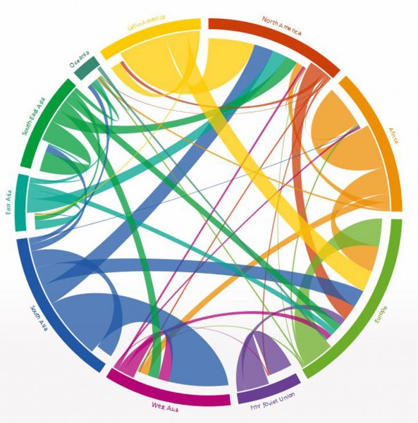
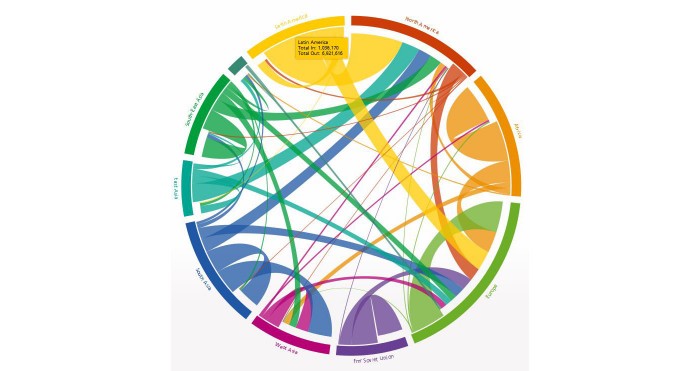
Researchers Nikola Sander, Guy J. Abel and Ramon Bauer of the Wittgenstein Centre for Demography and Global Human Capital in Austria created this innovative, interactive visualization bringing the new estimates of global migration flows to life for four, five-year periods from 1990 to 2010.
Not only does the graphic represent the millions of people who migrated during that period, it allows you to drill down and see the data from and to specific regions or even countries.
You can play around with it yourself here.

Major migration trends that stand out in the plot include the six million plus people who left Latin America for North America and Europe between 2005 and 2010, and the waves of migrants spurned by the dissolution of the Soviet Union and conflicts in Africa during the 1990s.
Other trends in migration visible on the graphic are harder to explain: For instance, between 1995 and 2000 just over 100,000 people left the United States (mostly migrating to Europe), compared with well over one million who left during the other three time periods in the data set. Was everyone just happy to stay in the U.S. during the Clinton years?
Though the graphic doesn’t zoom down to the state level, census data tells us that Washington has grown far more “birthplace-diverse” since 1990, in line with the national trend shown in the graphic. But unlike the U.S. overall, where the vast majority of migrants came from Latin America, almost 40% of immigrants and refugees to Washington hailed from Asia.


